Chris Woebken has created some pretty curious new ways of interacting physically with digital or plastic money.
Category: design
Bank of America Online Banking’s user-friendly password strength indicator
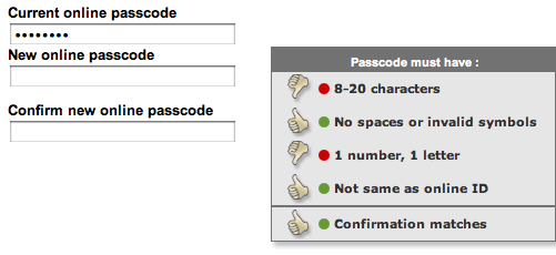
Like many Web services, Bank of America Online Banking provides you with real-time feedback about the strength of your password when changing your password. What’s great with their implementation is that it does it via a thumb up indicator for each security rule your password must comply with that gets updated as the user fills out the password. This technique is the best I’ve seen so far at guiding the user into providing a secure password into a short amount of time, thus improving an experience that is generally frustrating given the generally low perceived value by users of these increasing security requirements (just like with anything security-related, users don’t value it until something bad happens to them).
This is a nice evolution from indicators that merely tell you whether the password is low strength or high strength, or even worse: password management systems like P-synch that only tell you what’s wrong with your new password after you have hit the reset button, requiring you to enter multiple time the password and hit the rest button.
Before the new password is provided, only 2 rules out of 4 are thumb up (one might argue that they should be disabled until the user starts to type)

As the new password is typed, the thumps up turn green or red, until all are green and the user knows he can hit the reset button without fearing that the new password will be rejected.

