The future of the BofA iPhone app: besides better iPhone support, personalization?

I recently went through the 350 or so reviews of the BofA iPhone app. Here are my conclusions.

First of all, BofA should have called this app “ATM locator” instead of “Mobile Banking”, as the ATM locator capability is praised by most as a way to save on fees when traveling out-of-town or when in unfamiliar neighborhood, but the overwhelming majority comment on the fact that the application provides a very poor mobile banking experience on the iPhone.

What is meant by iPhone-specific experience?

iPhone-specific experience is the single most requested feature. I’m careful not to talk about implementation details here (native app versus iPhone-optimized Web app) as I still don’t have a strong opinion about which approach would ultimately bring the best user experience (native app developed in-house would require a learning curve that would certainly impact the quality of the app, while a Web app would have to be provided with JavaScript API wrappers of some of the SDK APIs like CoreLocation to provide an interesting user experience).

For most what iPhone-specific experience means is:

  • More finger-friendly (avoid pinching, which is a sign that the app is not optimized for the iPhone)
  • iPhone-specific styling like buttons instead of tiny text-based links
  • Consistency across the whole app (not a mix of a native for ATM locator and Web for mobile banking that does not instill confidence)
  • More condensed information per page using table views

Other interesting requested features

Here are the other interesting features requested:

  • Add support for customers in Washington and Idaho states.
  • Faster login (one suggested using a PIN instead of a long password)
  • Transaction reconciliation via mobile banking
  • Background download of information such as balance for quick one-click look
  • Better support for credit card accounts (currenly only balance is available, not transaction list)
  • Support for My Portfolio feature
  • “Something like E-Trade on the BlackBerry”.

Further thoughts: personalizing the mobile banking experience

The one thought that came out of this analysis was that mobile users have fundamentally different needs in terms of the information they want to see after clicking the BofA logo on the iPhone homescreen.While most expect to be able to do everything they can do with online banking, all expect to do much faster the things they do most commonly in online banking. And that’s where the design problem of shrinking online banking into a mobile app is in my opinion. On one hand, what everyone does most commonly is very different from customer to customer. On the other hand, an intuitive interface design principle is “Human interface cognitive load is proportional to the number of clicks/keystrokes/gestures“, which means that people won’t like the user experience unless they get to do what they want to do in the least number of clicks and keystrokes. This includes login in, selecting a transaction, entering amounts, etc.

To give a few examples from the reviews: those who travel don’t care about the ATM locator. Those who travel love it. Some only have a Credit Card account with Bofand don’t care about Checking/Savings.

Which leads me to think that the future of the BofA iPhone app or any mobile banking app for that matter will be in the ability for the user to personalize their experience by providing to BofA the shortcuts to the transactions they do most.

This may include just a transaction identifier and an account identifier (ex. “view balance” “checking-1234″) or more complex shortcuts that borders on programming/querying: for instance “view transactions” “CC-8456″ “Last 10 posted transaction” or “transfer” “$100″ “to John”.

Online banking will most likely be the place where these personalizations will be programmed. Until then, getting that 5 star rating on iTunes app store and getting everyone happy might be difficult.
A bank’s payment strategy in 3 words: Convenience, Convenience, Convenience

The Bankwatch had an interesting post titled Payments – the impossible dream for Banks? this week outlining the importance of payments for banks and the challenges they face in bringing about innovative and user-friendly payment solutions. Colin’s line of thought is that:

  1. Banking has moved to self service
  2. Self-service allows two types of financial activity … view balances, or move money.
  3. Moving money is payments.
  4. Payments, as currently offered by banks, are mostly hell and they cry out for innovation
  5. Payments innovation is not about technology or standards (SEPA), but about customer experience

I cannot but connect this “hell” experience with one of the most interesting questions raised during the Mobile Web Wars conference last week:

Why  people are willing to pay for apps on the iPhone, but not on Facebook?
Why people are willing to pay $3 for ringtones, but not $1 for music files?

A participant was arguing that the reason was the “mobile effect” i.e. the fact the mobile is a relatively new communications channel that is so personal that people value it more than the PC channel. But at the same time, Bart Decrem, CEO of Tapulous, a social app company for the iPhone, was saying in the background: “Ease-of-use, Ease-of-use, Ease-of-use”, in other words: convenience drives customer value and their willingness to pay.

Something pretty obvious some would say, but this idea was made to me much clearer in the last few days while trying out two new services: expensure.com, a London-based bill sharing online application, and TipJoy, an online tipping (“micropayment”) service. Both services address different user problems, but they both address it very well with an extreme focus on convenience.

TipJoy for instance, does not require what you would normally call “payees” to register: you can simply donate to any URL on the Web you want. As Web site owners register and add the TipJoy button on their Web site, they essentially claim by the same token URLs and collect tips. From the payer / tipper perspective, a single click on the TipJob button is required, nothing more: the button is already configured by the payee with a pre-defined amount (in the order of 5 to 50 cents). This is convenience at its best.

Expensure solves the problem traditionally solved by complex spreadsheet. I used it to share bills between an upcoming WE trip with my friends and I was extremely satisfied with the application. It’s all in the details. For instance, I was able to set a ledger and experiment adding expenses to it without having to invite my friends to the service, something that would have refrained me from starting to use it, b/c my friends are too busy to receive unwanted invites from applications I found not worth using after a trial. In this case, I did, and ultimately send the invite to 5 friends.

Both applications touch on the problem of payments, but with an extreme focus on a relatively highly context-specific problem and a very well designed solution to the problem. Yes, I could have used my bank’s transfer service, or checks, plus a shared Google Spreadsheet, as I did in the past, but I will certainly not do so now that my social network is almost set up with Expensure. Same thing with TipJoy: while I could have used a PayPal button on my blog, I can see the value of simply providing a pre-defined amount to users willing to tip me, and will most likely go with them in the end if I ever want to be tipped for writing these articles (I’m not really and I’m doing this on the side of my day job).

What was the most interesting to me, what the following FAQ excerpt from Expensure:

Can I pay somebody back using Expensure? Soon. Right now we are focusing on making Expensure the best shared expense tracking app out there.

and from TipJoy:

Why can’t I withdraw cash from my Tipjoy account? There are legal implications to allowing this transaction which we are currently working through. We expect that you will be able to withdraw cash very soon. In the meantime, if you have a minimum of $5 in your account after removal of applicable fees, then you can do the following with your earnings: 1. Donate to any official charity you’d like 2. Purchase an Amazon gift

Both of these companies are clearly focused on providing the best customer experience first, then only will they figure a way to monetize it. They probably have listened very well to this presentation from Paul Graham on how being benevolent and focusing on solving problems is more important than thinking about making money when starting a business.

The only thing that these companies are missing is that they are not a bank or Credit Union, but as good entrepreneurs, starting a new CU or bank is probably not an option they will choose. Just like PayPal partnered with Wells Fargo, I would not be surprised to see an innovative bank or CU partnering with them to handle the back-end aspect of their solution, in particular legal compliance in each legal framework/geography they do business in.

So, when real-estate agents are asked about RE investments strategy, it’s: “Location, Location, Location”. When asked about early-stage investments, VCs talk about “People, People, People”. Perhaps, when banks are asked about their payment strategy, or their general banking strategy for that matter, bank should say: “Convenience, Convenience, Convenience”.

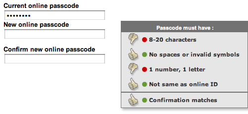
Bank of America Online Banking’s user-friendly password strength indicator

Like many Web services, Bank of America Online Banking provides you with real-time feedback about the strength of your password when changing your password. What’s great with their implementation is that it does it via a thumb up indicator for each security rule your password must comply with that gets updated as the user fills out the password. This technique is the best I’ve seen so far at guiding the user into providing a secure password into a short amount of time, thus improving an experience that is generally frustrating given the generally low perceived value by users of these increasing security requirements (just like with anything security-related, users don’t value it until something bad happens to them).

This is a nice evolution from indicators that merely tell you whether the password is low strength or high strength, or even worse: password management systems like P-synch that only tell you what’s wrong with your new password after you have hit the reset button, requiring you to enter multiple time the password and hit the rest button.

Before the new password is provided, only 2 rules out of 4 are thumb up (one might argue that they should be disabled until the user starts to type)

Password strength indicators prior to passcode change

As the new password is typed, the thumps up turn green or red, until all are green and the user knows he can hit the reset button without fearing that the new password will be rejected.

Password strength indicators during passcode change